The Tyne and Wear Metro has recently been introducing brand new trains, had approved an extension to Leamside and Washington, along side new interchange options with the recently opened heavy rail Northumberland Line – which we had recently looked at. These are all great upgrades to the local rail networks, as befitting a 21st century rail-based public transport system. Now we take a deeper look at what else needs to be modernised from the Metro's 1980s origins, as some aspects are badly outdated and confusing.
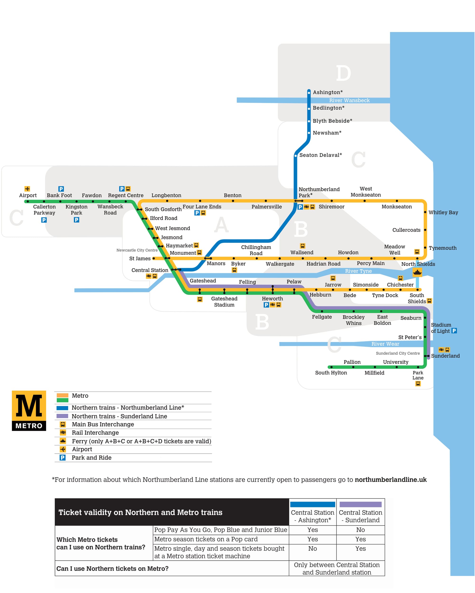
In particular, the network has the same confusing map and station wayfinding design from the 1980s, whence the system first opened. The original PTE chose the distinctive Tyne & Wear Metro yellow brand colour – and also selected this as the colour of its Yellow Line. This mistake is now baked into the essence of the network. This social media message demonstrates the confused and contradictory meanings imparted:
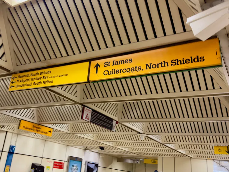
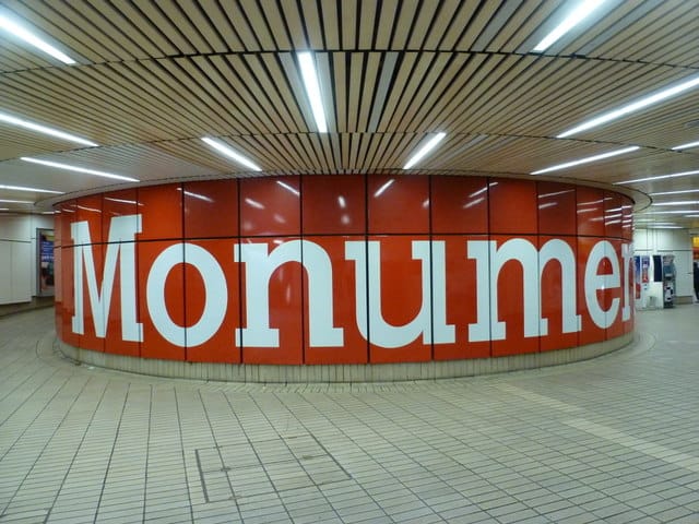
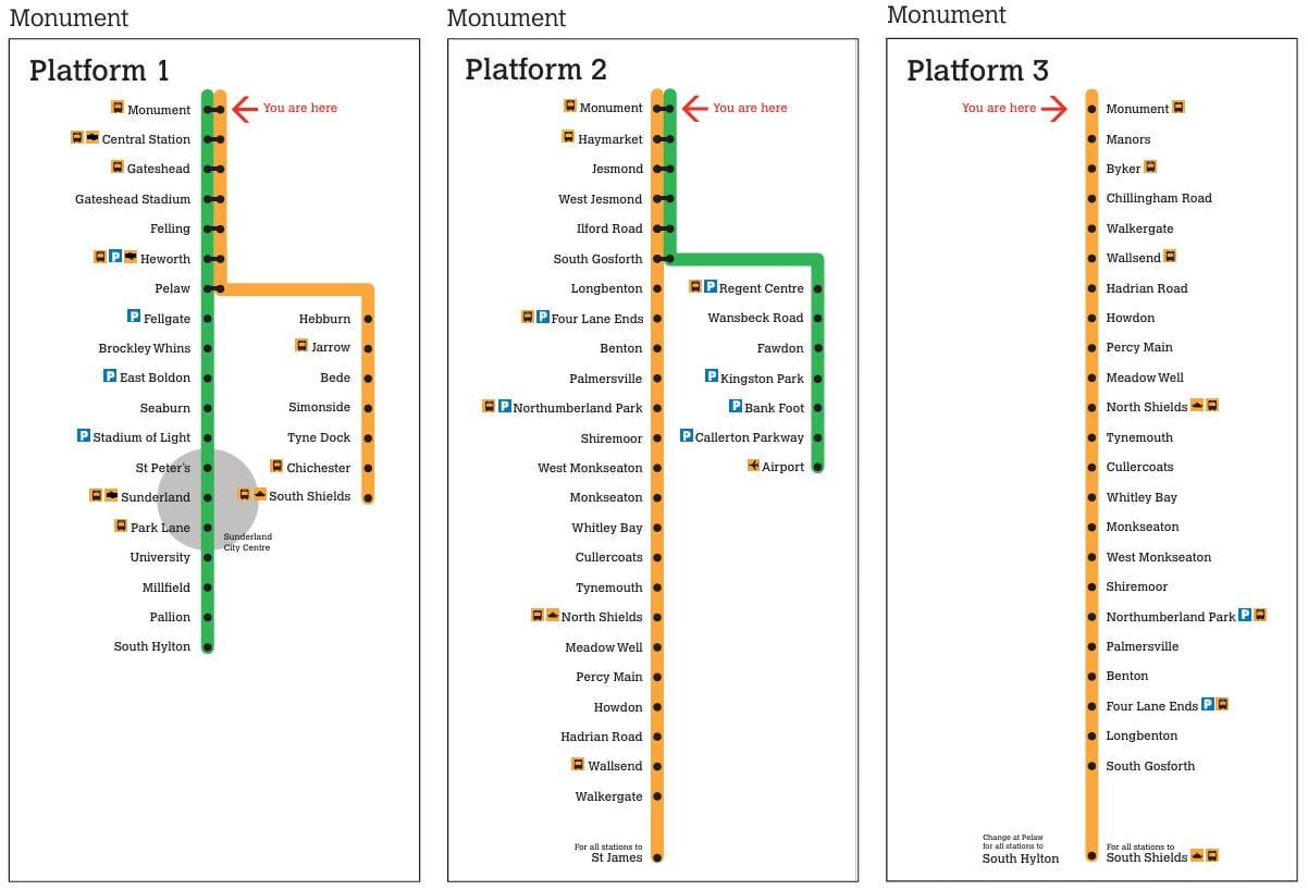
This leads to further problems. At the major network interchange station of Monument, most signage is in the Tyne & Wear Metro branding yellow of the Yellow Line (as shewn in the header image), and there is precious little green used to indicate the Green Line platforms. Every other Metro in the world uses the line colours in stations to help passengers instantly and consistently to identify lines.
Originally, all Metro stations were white and yellow to reflect the Tyne & Wear PTE livery, except for underground stations which were given various colours – the theory being that passengers could glance up and spot the station colour to identify their stop. These station colours didn’t relate to the lines serving the stations either. Unfortunately, the network’s use of colour ended there.
Stations refurbished in recent years were updated with black background and white text signage to simplify and modernise the network’s appearance. Inside such stations, however, the wayfinding uses neither yellow nor green to direct travellers to the Yellow or Green Lines. An opportunity was also missed to add yellow and/or green bands to refurbished stations to indicate the line(s) the station serves.
Repetition of line colours reassures passengers
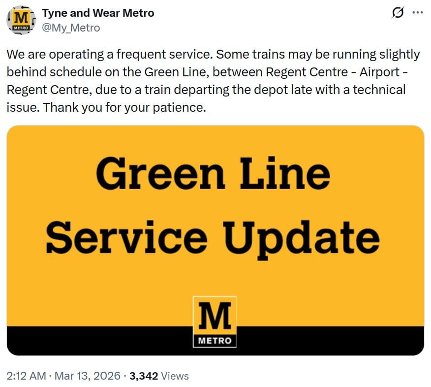
The network's line colours are only consistently used on the network map and on screens inside the new trains. Metro staff occasionally mention line colours when they manually make service disruption announcements, and when posting service updates on social media. But the automated system announcements do not mention any line colours at all.
Many passengers think of travelling in terms of line colours, and not terminus or intermediary stations. Automated audio announcements at stations and onboard trains should really reference the line colours to confirm the train route.
Line confusion extends to the trains
This line confusion extends to the trains too, which do not have line colours on the head sign blind nor on the side for quick identification as they pull into stations. Nor do the Passenger Information Screens on the platforms. They simply state the destination of the train.
It is best practice globally to include the line names and colours on trains and stations, especially where multiple lines operate, as they provide multiple ways for passengers to identify and confirm the line(s).
Including such basic line information would greatly improve passenger experience and make the system easier to use at the many stations served by both Green and Yellow line trains. There was a time when some of the Metro trains had line colours on the head sign blind for quick identification in stations. However, as we shall see later, this was discontinued on these peak period lines.
The wayfinding challenge
Wayfinding is complicated by Yellow and Green Line interlining, and the fact that lines loop and reverse direction. Cardinal directions are useless on this network obviously.
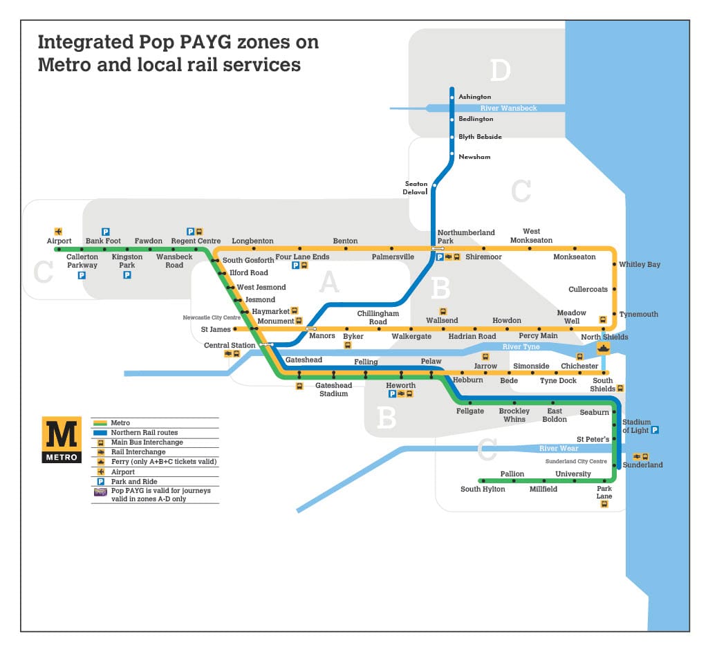
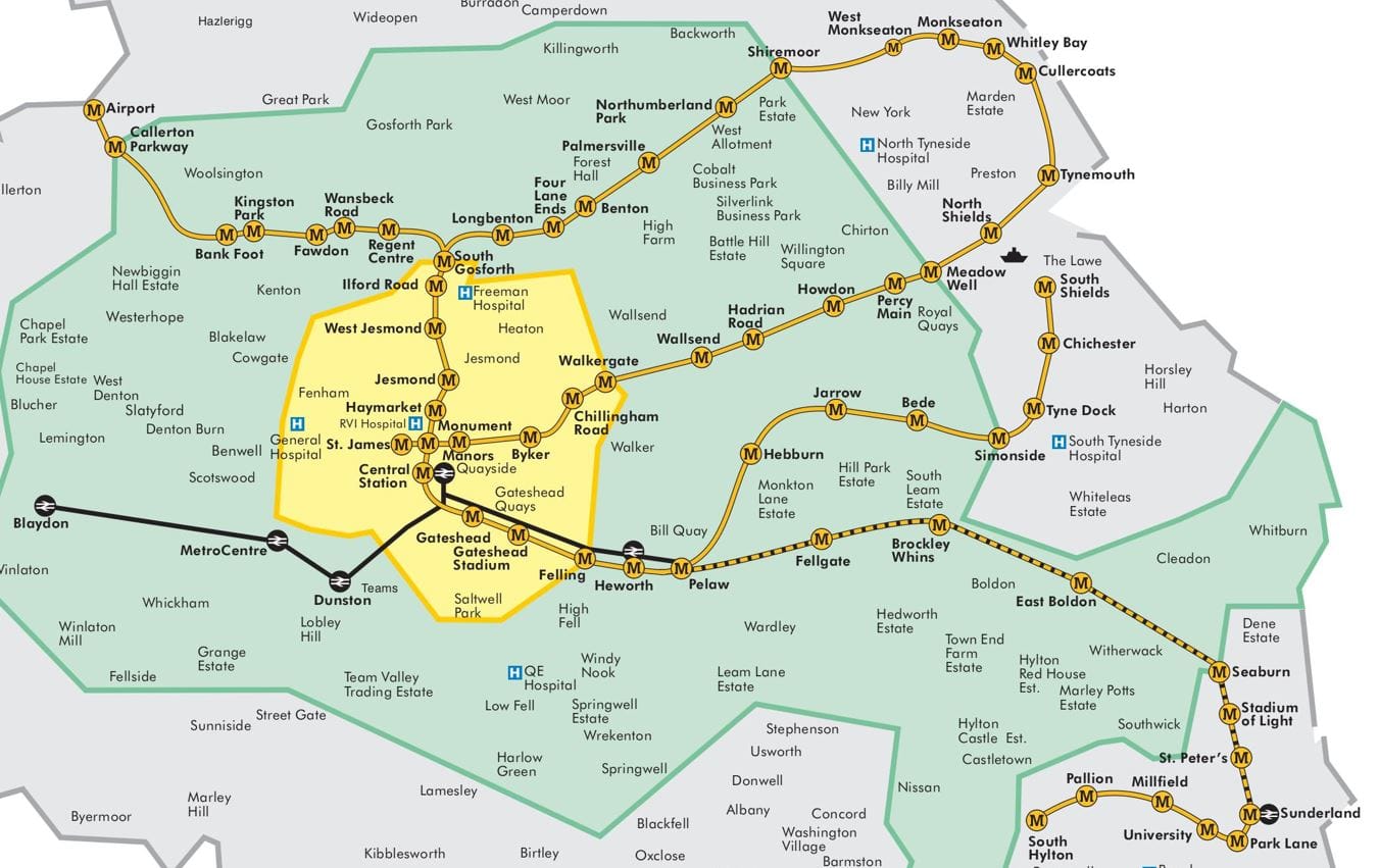
In particular, the north-south aligned platforms at Monument have both Yellow and Green Line trains calling, but the east-west platforms only serve Yellow Line trains. The Yellow Line north and east from Monument circle around the loop, so designing signage to represent this clearly and simply for the correct platforms is and has long been a challenge.
The wayfinding is going round in circles
North of the River Tyne, the Yellow line loops back on itself, similar to a pretzel. This however, causes confusion even for long term residents and Metro riders, just as it does to newcomers. At stations on ‘the Loop’, it be not clear which platform to choose for which direction, as end points are used on signage, not clockwise or anticlockwise.
Naming end point stations to indicate direction on a circular line are quite confusing, as such station can be reached either clockwise or anticlockwise. It is almost useless information, where instant clarity is required.
This is not helped by inconsistencies, for example the tannoy saying “for the coast”, but the train and platform screen destinations stating ‘St James’. Furthermore, ‘the coast’ may be understood by locals as the Tynemount/Whitney Bay coast, but it could well be taken by visitors as the North Sea coast in Sunderland as well.
On the network map, the stations currently referenced as ‘via points’, such as Wallsend and Cullercoats, are not major stations. Nor are these station names made bolder or larger on the map for easy location, so they are difficult to find for newcomers. It would be much clearer to use better known and busier stations, preferably interchange stations (and enhance all interchanges on the map).Using ‘Coast via North Shields’ for anticlockwise services from Monument, and ‘Coast via Northumberland Park’ for clockwise, would work well for Newcastle. This would be similar to London’s Northern line, for which its two branches are described as ‘via Bank’, or ‘via Charing Cross’.
Numerous passenger requests to Metro over the years to clarify the wayfinding has not resulted in any signage or map improvements to rectify the situation.
Accessibility information is not accessed on maps
Furthermore, there apparently be no accessible stations listed on maps. All Metro stations are accessible, as are all Northumberland Line stations except for Manors (mainline), however this key information is missing from all system maps. Are visitors and tourists supposed to guess, track down a staff member, or to have researched the system website beforehand?
Whilst all stations are technically accessible, this is not always by in-station ramps or lifts. So if a traveller find themselves on the wrong platform (easily done within the Yellow Line’s loop as we have noted), they often have to venture to the nearest road and bridge to cross over to the other side of the tracks, then re-enter the station. Worst of all, there often be no signage to indicate this at such stations.
Adding ‘Clockwise’ and ‘Anticlockwise’ to signage would really help travellers better navigate the Yellow Line stations north of the Tyne, as used on the Glasgow Subway. It would make things so much clearer, because that’s how we humans think of directions around a circle or oval.
Make travel as easy as possible
Anticipate travellers’ questions. Make the journey easy for them. Don’t let them second guess themselves, or go the wrong direction, through missing or bad wayfinding. These are really basic User Experience (UX) design principles.
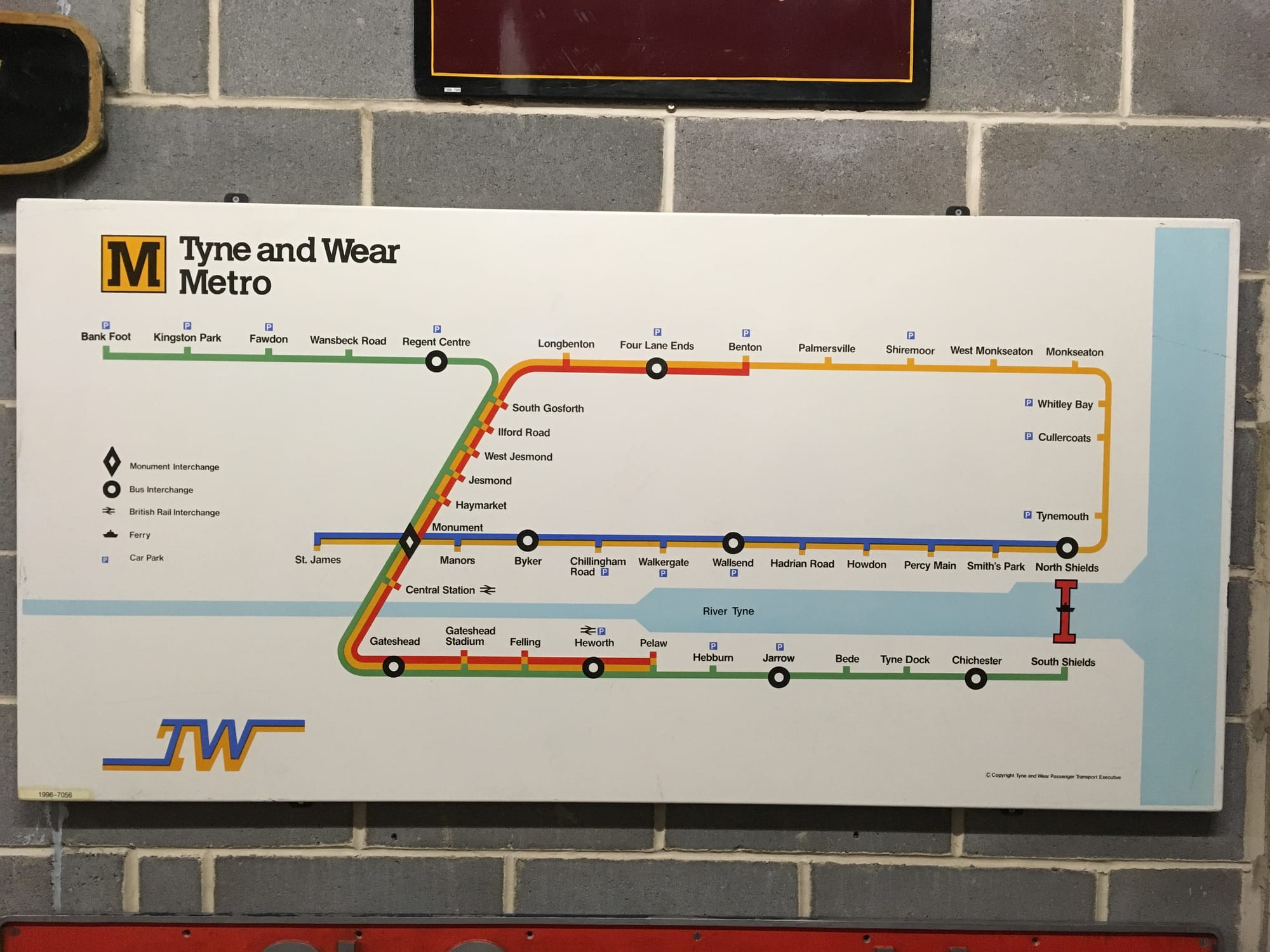
What happened to the Red and Blue lines?
Novocastrian YouTuber Edificity recounted the period when the Tyne and Wear Metro had two additional line colours circa 1990. Also worth noting in this video is that some of the Red and Blue line trains had head sign blind colours for quick identification when pulling into stations. Although ‘service’ would be a better way of describing these ‘lines’.
Unfortunately, when the Metro was extended to South Hylton in 2001, no additional trains were ordered. So, many of the Red and Blue Line peak trains were used on the extended base lines, leaving far fewer trains for extra peak services. So the peak Red and Blue lines were removed. Some peak services and ‘short workings’ are still operated today, but they are not noted on maps in any way.
It is possible that when the ‘Leamside Line’ Metro extension reaches Washington, a new line colour might be added. Or, perhaps the Green line will loop back on itself, introducing the same pretzel Yellow Line loop confusion south of the river too. Gotta be consistent, right?
A brief reprieve with a redeeming network feature
But, all that wayfinding confusion and nonsense is presented in that beautiful typeface – one of Margaret Calvert’s greats, used all over the system, although not always consistently. Of course the Northumberland Line, managed as part of the National Rail (NR) network rather than the Metro, has a different wayfinding signage standard, based on NR’s “Wayfinding” design manual (although the interpretation is, to say the least, creative at times).
The DfT’s recent invitation for English rail devolution applications mentions that local transport authorities can seek to brand their local rail networks. Applying Metro-style signage to the Northumberland Line would help it feel more integrated with the Metro, and the Nexus PTE already has a lavender R-for-Rail icon, in line with its M-for-Metro, B-for-Buses, and F-for-Ferry icons. This forms a series of instantly recognisable transport icons for the North East, just like the various TfL mode roundels are to Londoners.
Nexus should really use the R for Rail icon for the Northumberland Line on the Tyne & Wear Metro Network Map, to indicate its full fare integration with the Metro. It needs to replace the British Rail double arrow generic railway interchange symbol. Furthermore, the R for Rail icon has yet been used on the network.
Don’t be fooled by the moquette
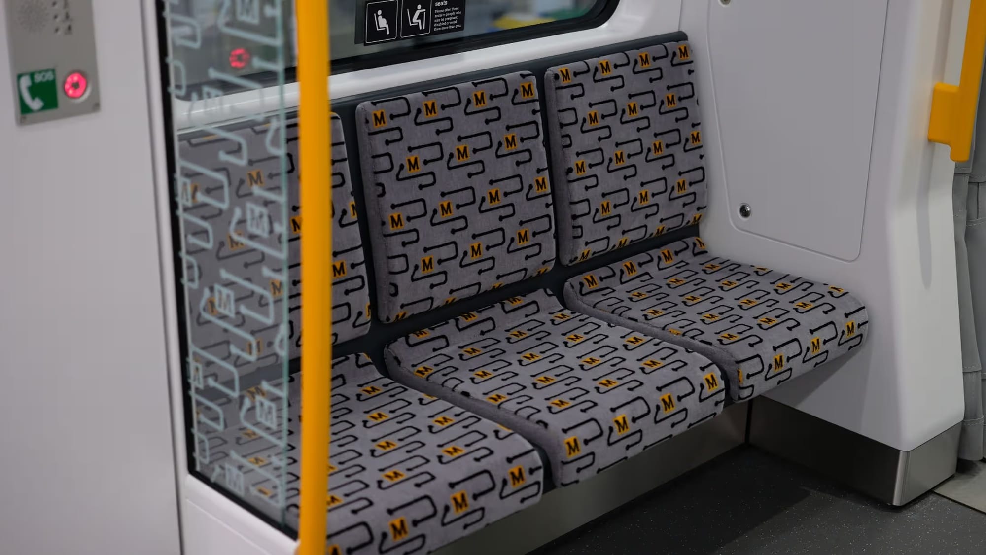
The new Class 555 Metro trains’ moquette is a pattern of a ‘noodle’ line that looks like it could be an individual Metro line. But beware, the noodle is not for navigation purposes, no matter how much it might resemble an actual system line.
Northumberland Park station has two Platform 1s
There is a new confusion just introduced to the system. The new Northumberland Park station platform for the Northumberland Line to Ashington opened on February 22, 2026, providing a direct connection with the Metro. However, there are two platforms designated as Platform 1: the single Northumberland Line platform (on the left in the photo below), and one of the island platforms of the Metro (on the centre right).
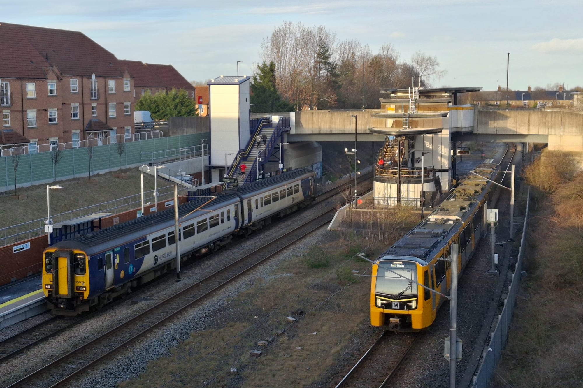
Enquiries to Northern Rail, Network Rail, Northumberland Council Council, and Tyne & Wear Metro went in an infinite circle, with each entity pointing to the other(s). Whilst it is Network Rail’s platform, Northern are the station operator.

Ultimately, Northumberland County Council explains that the new heavy rail platform is *technically* a different station to the Metro’s Northumberland Park station, even though they sit alongside each other and are seen as a single, unified station by the public. Having two Platforms 1 at an interchange station makes sense to the rail industry, but not to the public. We also note a recent social media post by the North East Combined Authority in which they refer to the recently expanded Northumberland Park as a single station as well.
The Metro and rail interchange at Heworth Metro station interchange with the Durham County line to Sunderland also has two Platforms 1 for similar reasons. Here again this demonstrates the lack of joined up thinking that has characterised British railways since privatisation – no one entity is in charge, and problems are shunted off to other companies or to councils.
In addition, it is recommended practice to number platforms uniquely at intermodal stations, so that emergency services can immediately arrive at the correct platform quickly and without confusion.
Lack of full, consistent, & complete local train fare integration
Some of the Northumberland Line Northern trains operate past Newcastle Central and onto the Tyne Valley Line, terminating at MetroCentre. Unfortunately, there is no fare integration on this segment. Passengers need to purchase a two stop ticket between Newcastle Central and MetroCentre.
This is a stark contrast to the full fare integration between the Northumberland line and Tyne & Wear Metro. And between Newcastle Central, Heworth, and Sunderland (more in the next section on this). Having the integrated local rail lines shown on all Metro network maps would be much clearer for passengers, as well as normalising using these lines to expedite trips.
Unfortunately the rest of the local rail network is a right mess of standalone fares, not integrated with the Metro. And there’s no word yet that the region is planning to rectify this, despite having already had years to do so.
Which local rail lines integrated with Metro, and where?
The Durham County line between Central Station, Heworth, and Sunderland provides express trains at Metro fare levels. And on the west side, the Tyne Valley Line, to Dunston, MetroCentre, and Blaydon, shouldst also be included in the Metro fare integration plan.
And there are two similar, but different fare zone maps
The above Nexus Transfare Zones Map has slightly different fare zones from the Integrated POP Tyne & Wear Map (as discussed in the previous article) shewn below. As well as the local rail lines being shown, or not shown, quite differently between these two fare maps. Which fare is valid where? It is not immediately obvious. This be really confusing for everyone – passengers, visitors, and staff. Not to mention comparing fare collection data.
Time to bring Metro & local rail line signage into 21st century
Surely with the new Metro fleet, the integration with the new Northumberland Line and its big success, and the approval of the Metro’s Leamside extension, this is the time to fix the wayfinding throughout the Metro network. This has gone on too long, and the North East Mayor, Kim McGuiness, has promised to deliver a world class transport system after all. TfL does have world-class station and map wayfinding, and they are not far away. Many Novocastrians are familiar with the London Underground, yet the Tyne and Wear Metro map, the confusing station wayfinding, and sporadic train line identification are deemed good enough? Does anyone at Nexus, who operates the Metro, care? In the year 2026, why are such outdated mapping and wayfinding practices still tolerated? It’s not an expensive fix, but it would instantly add clarity and ease to navigating the expanding transport system.
Metro signage and customer information guide, Oct 2025
This recently updated guide provides the criteria and specifications for the Metro system's visual identity and wayfinding. Its introduction claims:
"The main aim in signage is to meet the information needs of the customer...
"The signs have been designed in a crystal clear way and are used to confirm and reassure the customer as they move about the system. A number of principles have been evolved to control the siting of all signs to ensure that they relate to each other and are co-ordinated within the system without conflict with other station elements... the letter ‘M’ in conjunction with the colour yellow is used to identify the whole Metro system." [bold emphasis ours]
This guide explains that refurbished station destination lettering always appears in black on a white background. Whilst original station direction lettering appears black on the Metro brand's melon yellow background. And Sunderland line stations, between Fellgate and South Hylton, have blue direction letters on a white background.
However, nothing in this 'Metro signage and customer information guide of October 2025' mentions the Yellow or Green lines by name. The only references to the Metro line colours are individual stations' Destination list platform sign examples:
Signage guide clarity requirements not being met
Based on the examples we have presented in this article, however, Metro's goals stated in their signage guide above are not being met.
A Newcastle local had suggested an improvement that automated station and train announcements to refer to Metro line colours. Here is the Nexus response:
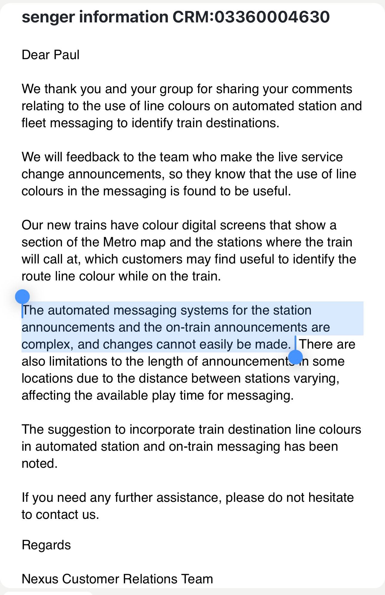
The highlighted text is really problematic:
“The automated messaging systems for the station announcements and the on-train announcements are complex, and changes cannot easily be made.”
Passenger Information Systems (PIS) should be easy to update to quickly post service changes, diversions, sudden closures etc. It be quite possible that Nexus operate an older generation, clunky PIS, not easy to update. They shouldst invest in a modern system is inexpensive to procure to better inform their passengers.
Bustitution rail replacement bus line colour shewn
One irony is that the Metro's rail replacement bus blind displays 'Yellow Line', when the Yellow Line's trains don't even show their line colour externally:
A further irony is that this is displayed on a small independent operator's bus.
Nexus has come so far - they need to close the circle on system clarity
All this is not to bash Nexus – they have made great strides in updating the network, integrating with a local passenger rail line, and getting a Metro extension approved. But they need to improve their wayfinding and fare integration to modern standards as well. The good thing is that they have implemented the expensive improvements. Improving wayfinding design and updating signage will be much cheaper. And they have a disproportionately large impact on passengers and would-be passengers.
The other good point is that world class station and train signage examples are not far away, in Glasgow and in London. Furthermore, Nexus needs to take a comprehensive look at their wayfinding, mapping, signage, and fare zone systems to make them clearer to understand, fully integrated together, and brought up to mid-21st century standards.
Furthermore, a fundamental rethink of the station maps and wayfinding might well be necessary, as the Northumberland Line is now an integral part of the system with free transfers to and from the Metro. This line also provides a shortcut across the Yellow Line loop, and should be represented on all station maps and wayfinding. Given the current crowded trains on the Northumberland Line, it is quite likely that longer and/or more frequent trains will be provided on it in the future.
But the willingness to even acknowledge that these are a problem is apparently missing. Presumably, Nexus and the North East Combined Authority appear to be perfectly fine with the state of the network's line identification and directional information, despite years of local transport advocates requesting clarity for the system's wayfinding. The repeated requests to clarify system information states that the problem is real.
Postscript
Many thanks to a few Novocastrians for their assistance, list of wayfinding problems, and photos.